The Journal Of Colors: The Selection Of Color For Your Art Is An Art In It Self
Here I will ask you to slow down where it comes to color,
but I also present an obvious shortcut in the end, both ways will have you learning in a jiffy.
Color combinations are all around you,
but you need to discover and catalog them.
And then create your artworks in harmony,
with the colors that speak the most.
One of the horrible tragedies of school,
are those cheap pre-mixed paints, they speak nothing.
They attack art,
they hurt it.
Long before you move beyond Graphite and
coloring with the gentle beauty of Coffee and Tea.
You need to begin keeping a journal of colors,
don't make difficult mixtures.
Make sure that you dot next to your color,
what you have mixed, so that you can re-create the colors, without guessing.
As you go through your day,
pay attention to color combinations around you.
If you find something interesting try capturing it in your color journal,
you buy a mini watercolor kit with all the classical colors and keep it near by.
Alas, speed they slowly towards color,
the world of mixing color is a world of poetry.
Worlds of poetry can not be hurried,
they have to come to you.
If you are not sure which colors go where,
then don't paint, yet, just let the under-painting be.
Note that colors are best added, slowly and in layers,
so that you can keep watching your art develop.
Watercolors for example are a high precision instrument,
because you create the color semi-transparent layer by semi-transparent layer.
You don't paint with the color you need,
you apply transparent layers of color until they stack up to give you the color you wanted.
Moreover, there are these impossibly beautiful color combinations,
Purple & Orange Gold, White Pearl & Raging Red, Shining Gold & Scarlet, Green Pea & Leaf Brown, Sad Teal and Lost Pink.
And when you create your portrait around those colors,
the colors will have their own say.
They will add a harmony,
that delivers your art.
There are colors that make no sense,
they may go together, they may be the colors in your reference or subject, but they speak, nothing.
And I hate to say it,
but they should be avoided.
Don't use colors that have nothing to add to your art,
or have no reason to be in your art, use only those combinations that go together
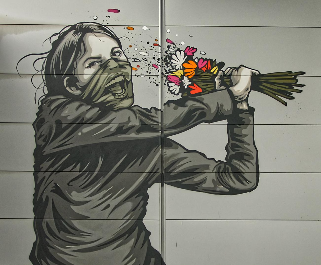
The people that know color well, are the Graffiti Artists,
3D Graphic Designers, and Computer Art Designers.
You can see different artists, and unique artworks,
reusing the same color combinations.
Precisely, because,
the selection of color is an art in it self.
Before you use color in your art,
you have to learn to observe it.
Perhaps, create a catalog of color,
which maybe you could share with the world - and what a beautiful poster that would make.
By the time you discover you are ready,
you won't need to think of primary colors and opposites for mixing.
You'll have your own,
much more precise ways that make you colors glow.
But is is also OK to hurry,
so as long as you stand on the shoulders of giants.
And that is my shortcut,
copy colors of artists that speak well with them.
So as long as you know that color selection is an art,
and that your combinations have to be meaningful.
So as long as you don't get stuck,
just picking whatever colors your models wore, or subjects were painted with, you'll be OK.
Another way to think about it is,
this:
When you find something you like,
don't pay attention to the color it has...
But instead ask, which of the precious color combinations that I love,
would make this portrait or painting even better.
And then make a dozen little miniatures and sketches,
and just try them out, your sketches, also become a work of art.
Consider framing your sketches,
or maybe just sketch on a large poster, that then can hang at the gallery next to your painting.
You search for subject and color harmony,
is sure to tell a beautiful story.
Finally, once you find the harmony of subject & color,
then you are well on your way to a new masterpiece.